Last week, we did a deep dive on the topic of brand voice development, and the many benefits associated with building a voice and tone guide. This week we’re going to look at some voice and tone examples from well-known brands. We’ll examine how their tone shifts based on context and audience, and we’ll check out a few examples of voice guides. Let’s get into it!
Voice and tone in action: some real-world examples

First, a quick summary
As you may remember, voice relates to the personality of your brand, or how your brand speaks. Tone, on the other hand, refers to the emotional quality of your brand voice, and tone can change according to audience and context. Both of these elements get documented in your voice and tone guide, which outlines the rules and principles for writing brand-related content.
You may also recall that the common thread across successful brand voice examples is consistency. When you apply voice and tone guidelines consistently across all interactions, you get more effective content and better trust from customers.
Now, let’s take a look at some brands known for their distinctive brand voices.
Example 1: MailChimp
Everyone loves to use MailChimp as an example of a highly recognizable brand voice. And the example holds up. Take a peek at their voice and tone guidelines to see how they keep things on point.
MailChimp guides their writers with a set of four major principles to use when writing for the brand:
MailChimp voice principles
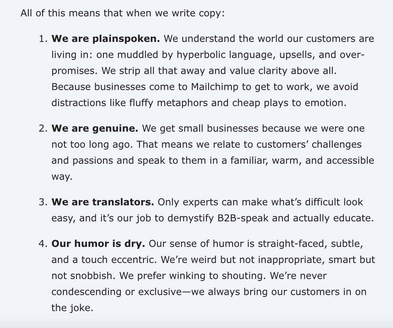
They strike a great balance between conveying their brand personality and communicating with clarity. Below, you can see examples of plainspoken copy directed at the small business customer:
Website call-to-action

Website content
MailChimp sure knows their target! Note how this content speaks directly to values and benefits that are important to the small business owner. Phrases like “work hard” and “create a buzz” and “get people excited” will resonate with any entrepreneur.

In-app messaging
MailChimp’s in-app messaging also takes a page from their voice guide. Here’s more of the “We are genuine.” principle in action “speak to them in a familiar, warm, and accessible way.”:

The takeaway: MailChimp’s focus on using clear, direct language that’s both down-to-earth and accessible helps their brand connect with time-crunched small business owners.
Example 2: Chipotle
Chipotle, a hugely popular brand with college students and millennials, also knows their audience. Their cheeky voice and informal tone keeps their brand fresh and relevant with the young adults.
While Chipotle doesn’t appear to share their voice guidelines online, it is still fun to explore how their voice plays out in their content.
Website content
Note the low-key, conversational tone and use of contractions to keep things casual and friendly. The content focus appears to be on simplicity and clarity.
The choice of 1-Tap Orders vs. 1-Click Orders indicates a mobile-first strategy, which makes sense.

Website notification
Consider the many ways the following notification could have been worded, versus what Chipotle actually chose. The choice of “gotta” keeps their messaging real and on point for their target customer.

Creative FAQs
Even Chipotle’s FAQ section is creatively worded. Instead of just asking “Do you have mild flavored foods for kids?” or “What kid-friendly meat options do you have on the menu?” they write the question in the voice of a concerned parent who is already a fan:

Twitter messaging
Chipotle hits it out of the park on Twitter, where their tone flexes to be highly informal. Their contests and giveaways are massively popular with their 1 million+ followers, and their silly, irreverent tweets earn tons of engagement. Note how their messages are quick and casual, in the style of texts between friends.


The takeaway: Chipotle isn’t afraid to take a risk or two to keep their voice real and relevant to their massive following of millennials and college students. This strategy pays off.
Example 3: Duolingo
The language app Duolingo is known for their gamified approach to learning and their playful, encouraging voice. They put their brand voice into action in their easy-to-read voice and tone guidelines, where they outline four key qualities that exemplify the brand voice.
Voice qualities

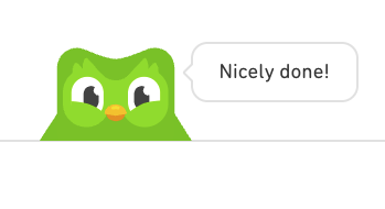
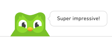
The expressive, playful voice helps users progress through the Duolingo experience. For instance, the user is peppered with compliments upon achieving successful results on a language test.
These cartoon-style bits of praise are conveyed by Duo the green owl – the company’s mascot/avatar and a constant presence throughout Duolingo. The Duo owl is so widely known he’s become a meme in his own right.
Each remark gives the user a tiny hit of dopamine and a sense of progressive accomplishment – keeping them engaged and motivated to learn more. Note the liberal use of exclamation points to convey excitement and positivity.
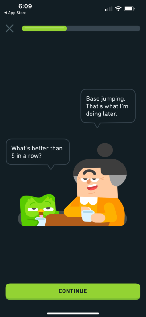
Humor – in this case ironic humor – plays a big role. Again we see Duolingo’s creativity in action.
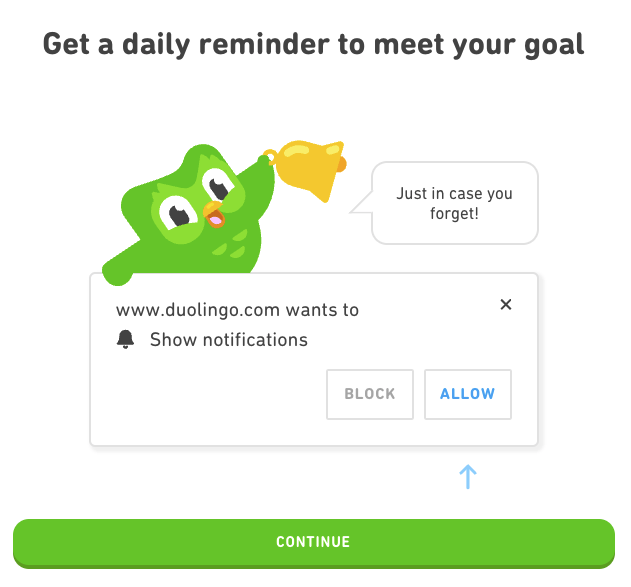
Note how this visually appealing, playful approach works to Duolingo’s advantage. They turn the traditional permission request for push notifications into a fun, friendly offer (on the web version). Hard to resist, right?
Permission request for push notifications
Website content: paid-classes program
As with other brands we’ve explored, Duolingo’s tone changes according to context. Here you can see a more serious, informational side to the brand – on a page introducing a new paid program.
The orientation is still inclusive and worldly, but not as silly and fun. This makes sense, since they’re speaking to prospective teachers vs. language learners.

The roundup
These voice and tone examples were easy to identify because these brands are known for being a bit playful and fun. It gets a little more challenging when you examine a more traditional company like Microsoft or Adobe. However, read their guides and you’ll find that they too write clear, concise, human-friendly language. These are excellent goals for any brand looking to connect and make an impact.
More voice and tone fun
Comparing brands’ voice and tone guides to their copy can be an illuminating experience. Not all brands share their voice and tone guides online, but tech companies often do. If you’re interested in exploring this topic further, here are three more voice and tone guides that are worth checking out.
Intuit
The Intuit Content Design pages cover writing guidelines for an array of Intuit brands. The writing is clear and to the point, which makes reading the guidelines an easy experience.
Shopify
Shopify’s Polaris is often referenced as an excellent example of well-crafted guidelines for content design. Their voice and tone guide is quite comprehensive.
Salesforce
The Salesforce voice and tone guide is available as a PDF and has a variety of useful examples of how to write for the brand.
Your turn?
Are you looking to develop a voice and tone guide for your brand? The process can be illuminating and the outcome can deliver a lot of value. Our content creation team can help you with brand voice guidelines, style-guide development, and high-impact copywriting and UX writing. Get in touch to have a conversation about your project.
LimeTech is a creative tech company with a focus on app development. We help brands grow their impact by building digital products that please customers and solve business challenges. Our work includes strategy, design, content, and tech planning. Check out our portfolio or reach out to start a conversation about your project.

![Everything is agile [updated]](https://limetech.co/storage/2021/11/yogendra-singh-0WYnzbYIRK0-unsplash-550x309.jpg)
![Nice to meet you, color! Color terminology explained. [updated]](https://limetech.co/storage/2021/09/reuben-4CCJ-NOUkB0-unsplash-1-496x330.jpg)