Hi, this is Kerry Abukhalaf of LimeTech, popping in today to introduce our guest blogger, Addie Kugler-Lunt, Co-Founder of Two for Tea Studio. Addie and her husband J.D. Lunt, are visual storytellers who help their clients claim — and communicate — their stories. I’m super excited to present their examples of visual storytelling. I know you’ll get a lot out of it. Enjoy!
Visual storytelling in action
Visual storytelling examples
As I discussed in my previous article about the elements of visual storytelling, today’s digital era has visual storytelling happening everywhere you turn. At Two for Tea Studio, we help our clients shape the stories they want to tell, and bring the tools to intentionally and strategically communicate. Today I’m bringing you examples of visual storytelling in action.
Example of hierarchy and movement
In the square design below, there are a number of design elements working together to create a visual story. All the colors are used to highlight the LimeTech brand. The leaf shape is a riff on the shapes in the logo. But making this leaf shape extra large and placing it to the right of center does even more: 1) It frames the text. 2) The off-center placement brings your eye from the top left-hand corner, down to the bottom-right corner. 3) The bright green color provides a focal point for the entire design.

The text is part of this story too. The way the beginning of the triple-arrow lines up with the end of the word “forward” causes your eyes to move forward, reinforcing the narrative theme. The arrows sit above the blog address to direct your eyes to the location you want the reader to go.
The hierarchy of this story is clearly laid out in this example. The largest text and design elements are the most important, with the most space around them. While this design may seem simple upon first glance, there’s a lot of thought and intention that goes into every piece of creating the visual story.
Examples of visual storytelling in template variations
Digital design often uses templates. Whether it’s a template design you found on Canva, created yourself, or bought from a designer, there are endless ways to make each version stand on its own, as well as remain part of a cohesive aesthetic.
In the three Fresh Tech blog designs below, you see how keeping the layout and text elements the same, but changing the visual signifiers and colors, tells the viewer it’s part of a series. The design works because the colors relate to the changing seasonal drink in the center but also compliments the LimeTech green that’s a constant.


Keeping the framework the same, helps people recognize it and remember it when they see it. But changing up the graphics and colors keeps this template fresh and catches attention. The white diagonal provides a bright contrast and dynamic movement that’s exciting. Template variations are also an effective way to bring the feeling of a long-form story to shorter related-content pieces. This is visual storytelling in action!
Example of focal point and contrast
The testimonial design below is an example of a design focal point using color and contrast in visual storytelling. When you’re working with a photo of a person as a starting place, you want to use it as a focus. Working within 90 Day Business Launch‘s brand color palette, I chose a dark blue background with mostly gold accents, so the black and white photo is highlighted.

Then, I used the starburst shape in the negative space around the round photo for two reasons. First, adding a similar round shape above the circular photo makes it appear larger visually. And second, the leading lines of the starburst graphic point to the photo, which draws your eye to it.
The high degree of contrast using a dark blue background, white text box, black text, and gold accents makes this text-heavy design easy to read. Visual hierarchy is used in the text and design elements, to direct the eye from the top with the name in bold, down through the body text, to the repetition of gold in the text box at the bottom. The text box at the bottom grounds and anchors the design.
Example of movement and color dynamics
Visual storytelling can be used to turn a simple chart or graph into a lively tale. In the related examples shown below, I used hierarchy of information, movement, visual signifiers, color, and layout dynamics to make a single columnar chart into something eye-catching and compelling.


When placed side-by-side, you can see the diagonal lines and asymmetry I introduced into these designs. I did this to create excitement in a sweeping motion across the page. Not only do these dynamics help your eye across the page, but they also build momentum, as a story structure does. This energy is supported by the combination of the teal and gold colors which is a pleasing but bold combination.
Can you imagine how much less interesting this chart would be if it had been colored gray instead of gold?
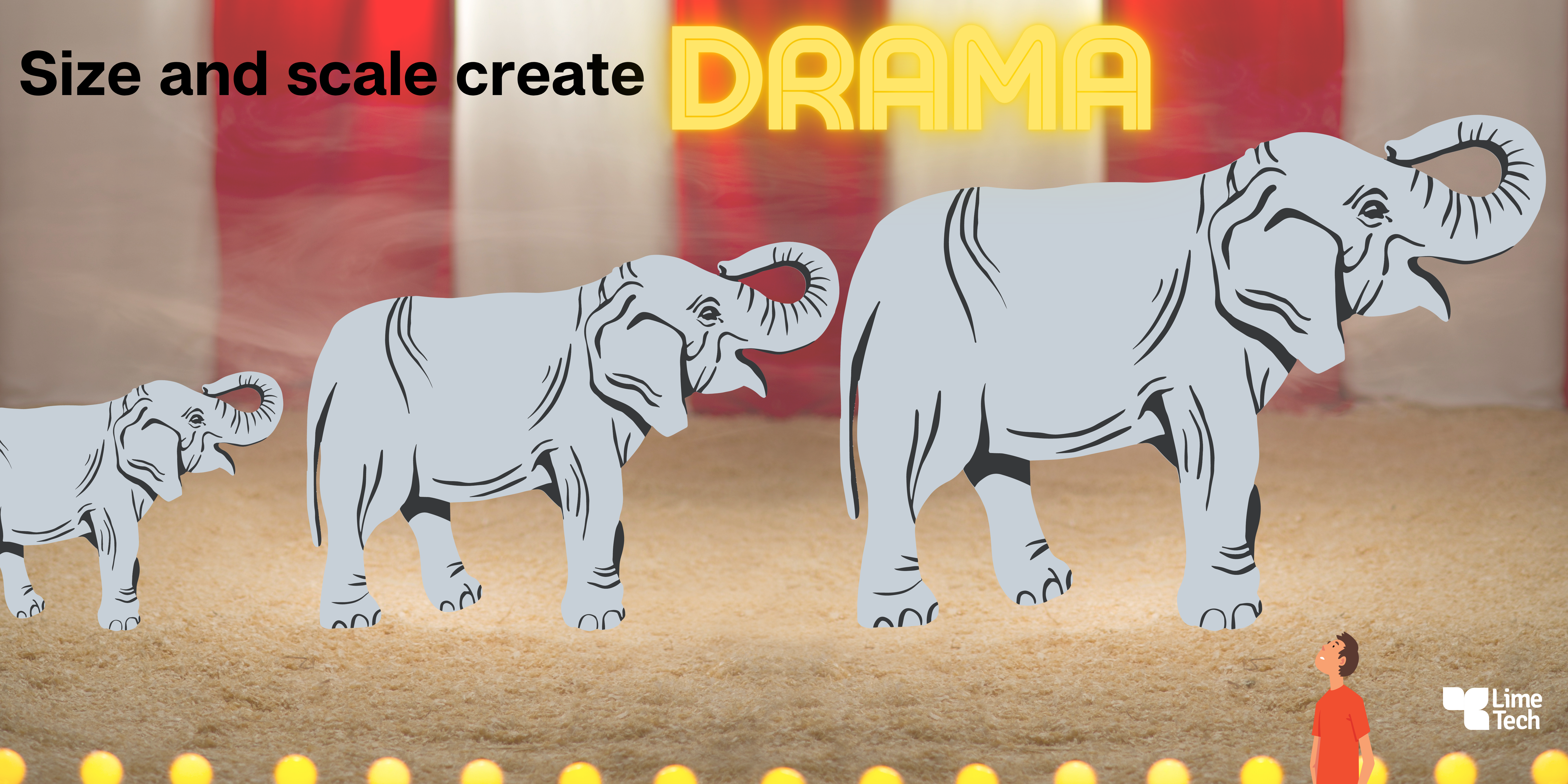
Example of size and scale
I created this design, with three elephants in ascending order of size, walking across a circus ring, for my article on visual hierarchy in content design. It illustrates the roles size and scale play to create dramatic effects.

There’s a lot of design elements happening in this circus ring but some are hiding behind the proverbial curtain. There’s an upward diagonal from left to right across the page shown by the elephants increasing in size. This diagonal creates movement.
The word “drama” is illuminated as though it’s a neon sign. It is a focal point that also balances the row of lights across the bottom. The tiny man looking up and back at the elephants, from the bottom corner of the scene, is demonstrating scale, without having to say a word. This visual storytelling example demonstrates how to use size and scale in a playful and unexpected way.
Example of visual signifiers
Visual signifiers include color and the psychological associations with certain colors and color combinations. I discussed these elements in more detail in my previous articles on choosing colors for your app and on color terminology. Specific objects and symbols are employed to appeal to a particular demographic group, a desired lifestyle, or aesthetic trends. The combination of visual signifiers supports the visual storytelling message.
In our Two for Tea Studio banner below, my husband J.D. and I wanted to reflect certain traits in a clean and clear design. We chose the background color, a dark blue with a hint of green in it, as a neutral and trustworthy base. From the dark blue background, many colors compliment and draw attention in bold (yellow) or subtle (soft pinky-peach) ways.
")
The name of our business relates both to music (Tea for Two is a song. Listen to Thelonious Monk’s version here.) and our love of the conversations that happen around a cup of tea. So we used two mint-colored tea cups that are touching, to graphically show a relationship.
Finally, we used word balloons with the tea talking to the viewer. This is a playful way to introduce the kinds of work we do with design and storytelling, and reflects our collaborative comics-inspired approach. Like in the previous examples, the text reads from left to right so there’s no confusion about how to read this story and the energy flows easily.
Example of leading lines and the power of mystery
Many of the designs in this article show leading lines, but none more than the example below based on a comics panel by J.D. Lunt. Leading lines are lines in the design that show the eye where to go next. While an average viewer might not be aware they are being led forward by this design element, designers are very aware of their usefulness.
Can you identify the several diagonal lines showing your eye how to navigate the page?

The text is also providing certain details about the comics class this design is communicating about. But the image of the open door leading out of the frame is what’s communicating the emotional and narrative weight of the story. It’s the ill-defined space of the open door that’s inviting the viewer to go deeper in. That’s the compelling mystery that’s key to the success of this design.
Exposing the interior of visual storytelling
The seven examples of visual storytelling in this article show you underneath the design to expose the foundations they were built upon. Now you have an idea of how the various elements work together to create fresh and compelling yet pleasingly familiar visual stories.
The best way to learn and practice creating visual stories is to do it yourself! It can be daunting to get started on your own. But when your stories insist on being told, it’s worth collaborating with people who are experienced and empathetic. With my husband J.D. Lunt, we launched Two for Tea Studio where we help our clients claim – and communicate – their stories.
Dive in with my free 4-Day mini course. In answering the writing prompts, you will get back to the roots of your story and then learn new ways share it, using visual storytelling. Sign up for “Uncover Your Deeper ‘Why?’ and Show it Using Canva” on our website.
Making comics is a low-barrier and fun way to try your hand at visual storytelling. To get started, try J.D. Lunt’s free mini-workshop: “Drawing Characters Who Communicate.” Sign up for both of the FREE mini courses in the footer of any page of the Two for Tea Studio website.
–
Editor’s Note* J.D. Lunt contributed to this article.
LimeTech is a creative tech company with a focus on app development. We help brands grow their impact by building digital products that please customers and solve business challenges. Our work includes strategy, design, content, and tech planning. Check out our portfolio or reach out to start a conversation about your project.
content creation content design design examples information hierarchy visual hierarchy visual storytelling

How to make a mobile app that stands out from the crowd
The mobile app landscape is crowded. In fact, a thousand apps are launched each day in Apple’s app store, and much more in the Google Play store. But you’ve got a great idea and you’re determined to push forward. Let's talk about how to build an app that stands out from the crowd.
Read more
Elements of visual storytelling
In the digital era, anyone involved in creating combinations of written and visual content is participating in visual storytelling, whether they realize it or not. Today's article, a guest post by Addie Kugler-Lunt of Two for Tea Studio, covers the elements of visual storytelling.
Read more