Hi, this is Kerry Abukhalaf of LimeTech, popping in today to introduce our guest blogger, Addie Kugler-Lunt, Co-Founder of Two for Tea Studio. Addie and her husband J.D. Lunt, are visual storytellers who help people claim — and communicate — their stories. I’m super excited to present their discussion of the elements of visual storytelling. I know you’ll get a lot out of it. Enjoy!
Elements of visual storytelling

In the digital era, anyone involved in creating combinations of written and visual content is participating in visual storytelling, whether they realize it or not. In today’s article, I discuss and elaborate on the elements of visual storytelling. At Two for Tea Studio, we aim to bring you the tools to intentionally and strategically communicate your stories. Included in today’s article are current and historical examples of visual storytelling, to help broaden your understanding so you can own and hone your story.
What are the elements of visual storytelling?
Visual storytelling is something people understand on an instinctual level. That’s because depicting stories in a visual way has been part of our evolution as a species since well before language. Cave paintings were recorded possibly as far back as 35,000 years ago. Early images include depictions of animals, the earth, and dwellings. Symbols that were repeated in stencil form are some of the earliest elements of visual storytelling, such as these examples from Asia and Australia:
There’s still a tradition on Sulawesi of mixing rice powder with water to make a handprint on the central pillar of a new house, Ramli explains, to protect against evil spirits. “It’s a symbol of strength,” he says. “Maybe the prehistoric man thought like that too.”…Paul Taçon, an expert in rock art at Griffith University, notes that the hand stencils are similar to designs created until recently in northern Australia. Aboriginal Australian elders he has interviewed explain that their stencils are intended to express connection to a particular place, to say: “I was here. This is my home.” Smithsonian Magazine
So how are elements of visual storytelling used today? Their uses and aspects have become more elaborate and complex than those prehistoric examples, but the purpose is essentially the same: to convey information in a non-verbal way that enhances the overall message and brings a greater emotional connection.
Why visual storytelling?
While languages are great useful tools of communication, they can fall short of conveying the full rainbow of human experiences and emotions. When you see or imagine a rainbow, you might be able to describe it to some degree, but its ethereal nature escapes capturing it in full. Now, consider how you might try to describe some of these emotional states – despair, rapture, awe – and you’ll feel the challenge of using mere language to communicate. Take a few moments with the image below to consider the power of visual storytelling:

How many stories could be created from this one image? Too many to count!
It’s important to make the distinction between using visual elements for idea generation or creative experimentation versus for clear communication. While visual storytelling can enhance visual communication with a particular message in mind, if it is not used intentionally, it can confuse, clutter or dilute the desired message. This is why it’s important to learn and use elements of visual storytelling with understanding and attention.
Elements: who is this for?

Too many people start by trying to aim for the widest possible audience. But instead of appealing to “everyone,” the work fails to draw anyone closer. This is usually due to a lack of forethought about your specific audience. Considering your audience is about more than basic demographics of age and gender. What are the interests, desires, lifestyle, and problems the people you want to talk to are living through right now? This can be reflected in your visual storytelling in two ways:
Consistent design
The first aspect of this element is designing a clear overall aesthetic. This part often comes fairly easily because most of the time we initially describe aesthetics in general terms, such as : 1) slow pacing, minimal text with light backgrounds, subtle neutral earth-tones, low-contrast, and soft-filter images, 2) clean and fast with angular lines and tiny pops of neon colors, oversized text that shouts, 3) lots of texture, multiple layers, rich jewel tones, and soft curved shapes, relaxed pacing.
A consistent aesthetic serves the story you want to tell by creating the visual world you have built to draw in your intended audience. This allows the people who engage with your material to buy into the overall aesthetic before they are even fully conscious of it. However, if the overall aesthetic is inconsistently applied, your audience loses interest and fades away, almost as quickly as they arrived on the scene. Visual signifiers work hand-in-hand with consistency in capturing and keeping peoples’ attention.
Visual signifiers
The second aspect of defining your audience is by using visual signifiers. Is what you’re trying to communicate something aspirational? What relational factors are involved? Are you inviting your audience to be co-conspirators with you? Are they learning something completely new and revolutionary, even shocking? Are you providing help or security for a problem they are having? What visual signifiers would convey these things non-verbally?
Visual signifiers include color and the psychological associations with certain colors and color combinations (I discussed these elements in my previous articles on choosing colors for your app and on color terminology); specific objects and symbols like a diploma for graduates, or a ring for the newly engaged; words or hashtags that appeal to a particular age group, and more. Specific visual identifiers and a consistent overall aesthetic, combine to support the visual storytelling message, from the first glance to the final page.
Elements: shaping stories

Once you know your audience and why you’re telling this story, you can figure out where and how to guide your audience. What is your desired destination?
By shaping your story by giving the audience guideposts, they can follow along instinctively with the peaks and valleys through the arc of your story and successfully arrive at the finish. Using story structures motivates people to come along with you all the way to the end!
There are various story forms or structures you can use. For example, the three-act structure (popular in blockbuster movies) and the more literary five-act story structure (from Greek mythology), are both commonly used and easily identifiable. While this element of visual storytelling is often overlooked because it takes sketching out beforehand, it’s effective and powerful.
Elements: writing visuals

Did you see what I did in the above two headers? Whether you noticed the wordplay or not, you may not have thought of storytelling visually in terms of creating shapes, or of drawing as writing visually. Writing and creating images have more in common than you may think. We can learn a lot from the art of comics here. Award-winning cartoonist Nate Powell explains it:
Comics operate on multiple levels at once – offering a more immersive, engaging reader experience than any other mass medium. (So much content is conveyed nonverbally, and our brains process it readily when we read comics!)
Comics can make huge ideas & subjects accessible!….(They don’t need to be huge ideas, though! Comics can just as easily be about donuts, squirrels, or the feeling of bare grass on your feet. ahhh!) Nate Powell on Instagram
All the aspects of comics that Nate Powell brings up in the above quotation equally apply to visual storytelling on the web and in powerpoint.
Monks as cartoonists?
Did you know that what we might mistakenly call “painters” of religious icons are actually called “writers”? This isn’t a new concept, either. If you zip ahead several tens of thousands of years from the prehistoric cave painters we discussed earlier, to the medieval and renaissance monks (around 1100-1600), you’ll find illuminated manuscripts. Monks, some of the few literate people of the era, served the illiterate population (including royal and rich classes) by making elaborate pictures to highlight key stories in religious texts.
They often tried to communicate the crux of the story in just one or two illustrations. Their brevity was only partly due to their slow and expensive process, using precious materials like rare color pigments and gold leaf. While monks often spent the majority of their working lives illuminating texts, their work of visual storytelling was also part of the physical work of being a monk.
When the text and visual work hand-in-hand, they reinforce the visual story in nuanced ways. However, it’s crucial that these two elements of visual storytelling don’t step on each other’s toes. Ouch! To dance in step together, each element is crafted to enhance, but not repeat, what the other element is saying. This careful coordination is how the page comes to life!
Elements: visual hierarchy
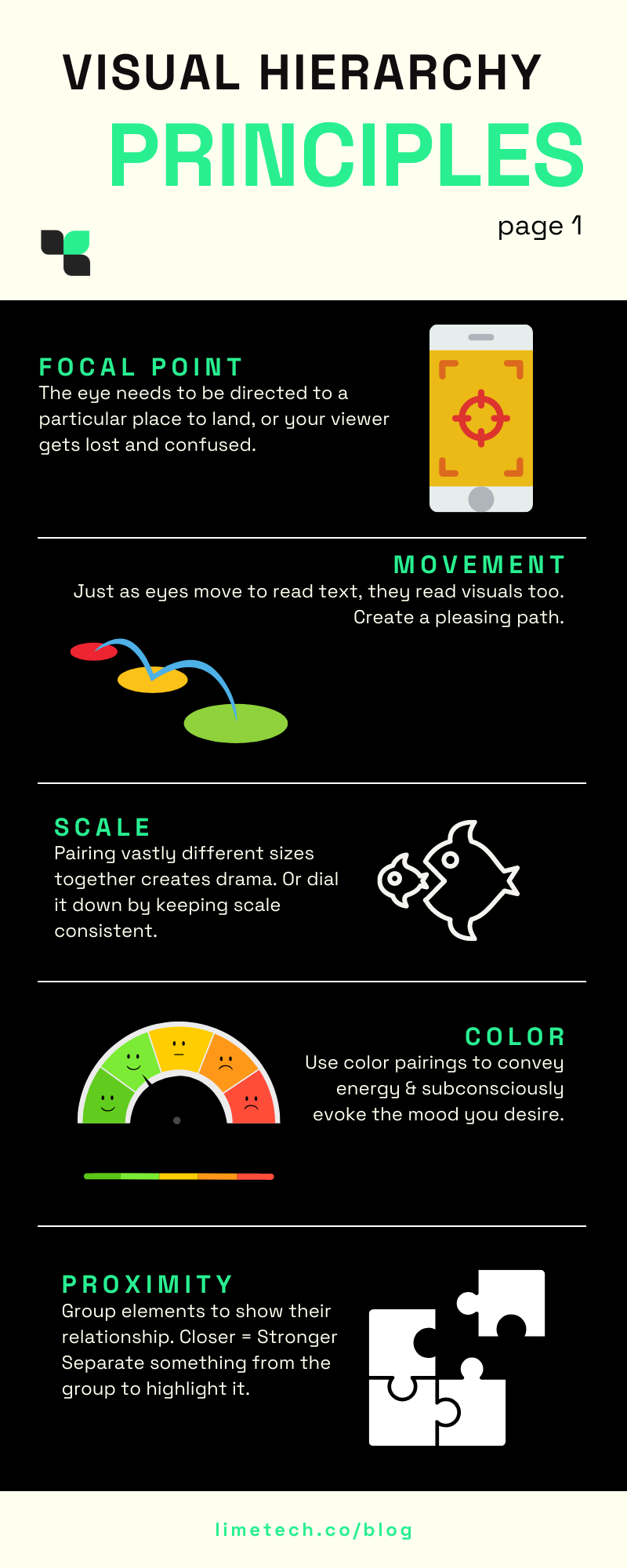
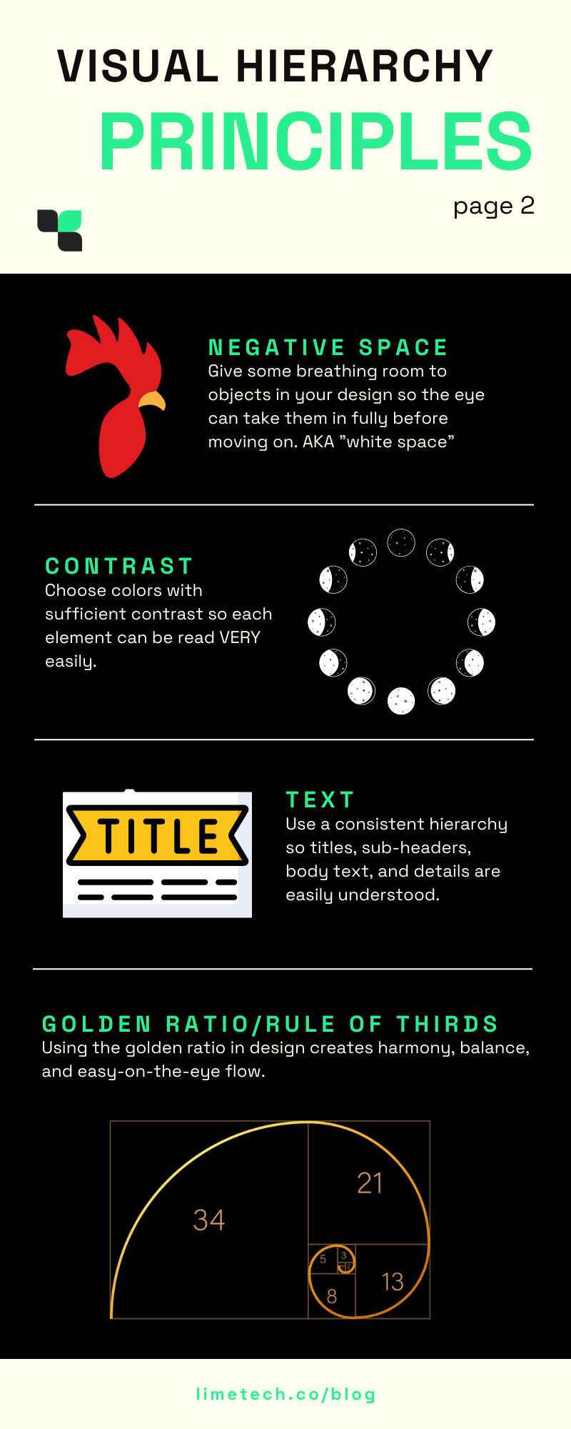
Without visual hierarchy, information is too easily mixed up, lost, or buried…making it hard for your people to be transported on your story journey. Employing the elements of visual hierarchy in your storytelling provides sign posts, maps, and directions along the way.
Principles of visual hierarchy that are shown in the infographics below include focal point, movement, scale, color, proximity, negative/white space, contrast, text, golden ratio/rule of thirds.
I discussed visual hierarchy in content design in more detail in a previous article, if you’d like to learn more.
Elements: dynamics of composition
Every aspect of the layout, from the images you chose, to the way you arrange your text is part of your content design. Using the elements of visual hierarchy above, you can create dynamic visual stories that guide the audience’s eye from one key point to the next. Keeping text close to an eye-catching image, and possibly having the image’s shape act as a pointer to the text, help keep the audience engaged with the story you are telling.
As discussed in the Writing Visuals section earlier, comics storytelling is a great example of how visual layouts help the reader navigate the verbal/visual information being presented. If you scroll through the Nate Powell piece quoted above, you’ll see the way in which every element on each screen keeps the eye moving through the maze of information in a path so natural, you barely have to think about it.
Do you remember how the monks illuminating the religious texts we discussed earlier were counted as physically working for their monastic order? As drawing and painting are physical acts, movement is an essential dynamic of visual storytelling. We can use the dynamics of movement to punctuate and direct stories to gradually build interest and intrigue. In tandem with a chosen story structure, compositional dynamics supply high and low points of drama that stir up emotion in the reader.
Playing against assumptions
Dynamics of composition can be used to play up or play against unconscious assumptions. For example, if we’re indicationing physical movement in the text, “Jenny is running.” We could depict Jenny running very very slowly with sweat running down her brow or we could draw her running so fast she passes a nearby car with a grin, among other possibilities. The combination of these elements of storytelling dynamics can challenge assumptions we may have formed from reading “Jenny is running.” in the text. Compositional dynamics in visual storytelling create an impact that words alone cannot.
Elements: wide-view visual storytelling
When you’re working with elements of visual storytelling to paint a cohesive picture, you have to continually step back to look at the material as a whole. Are you creating a consistent tone in both your prose and your visuals? For instance, the images chosen for this article all have warm browns bouncing off slightly cool off-white grays and light blues creating a bright-but-calm and optimistic tone. All except for the infographic, which is brighter and energetic, in order to draw attention to itself. It’s a little creamy-candy surprise in the middle!
You can have the best single component of a visual narrative, but if it does not fit in smoothly with the rest of the work, it can disrupt the flow of the story as a whole. So take a deep breath, step back, and take in the wide-angle view. Make sure all the pieces are working together to bring your readers with you. When you employ wide-view visual storytelling, even when the readers are not conscious of all the effort you put in, they will be bounding up the final incline, ecstatic to reach the summit with you!
Two for Tea Studio
The best way to learn and practice creating visual stories is to do it yourself. It can be daunting to get started on your own. And sometimes things can get foggy along the way. But when your stories insist on being told, it’s good to get some support from people who are experienced and empathetic.
With my husband J.D. Lunt, we recently launched Two for Tea Studio. We help people claim – and communicate – their stories. As part of the launch, I created a free 4-Day Mini Course to help you get back to the roots of your story and then share it, using elements of visual storytelling. Sign up for “Uncover Your Deeper ‘Why?’ and Show it Using Canva” on our website linked below. If you need individualized support in creating your brand story and visuals to go with it, I’ll be glad to chat about it. Just fill out this inquiry form and you’ll receive a personal reply.
Making comics is a low-barrier and fun way to try your hand at visual storytelling. J.D. Lunt’s 6-week live class, Basics of Nonfiction Storytelling, will get you going with weekly exercises and personal feedback. But first, try out his free four-day mini-workshop: Drawing Characters Who Communicate. Sign up for both of the FREE mini courses in the footer of any page of the Two for Tea Studio website.
–
Editor’s Note* J.D. Lunt contributed to this article.
LimeTech is a creative tech company with a focus on app development. We help brands grow their impact by building digital products that please customers and solve business challenges. Our work includes strategy, design, content, and tech planning. Check out our portfolio or reach out to start a conversation about your project.
