Special note* You can support designers in Ukraine by purchasing their digital products or hiring any of the people on this curated list from Creative Market.
Visual hierarchy in content design
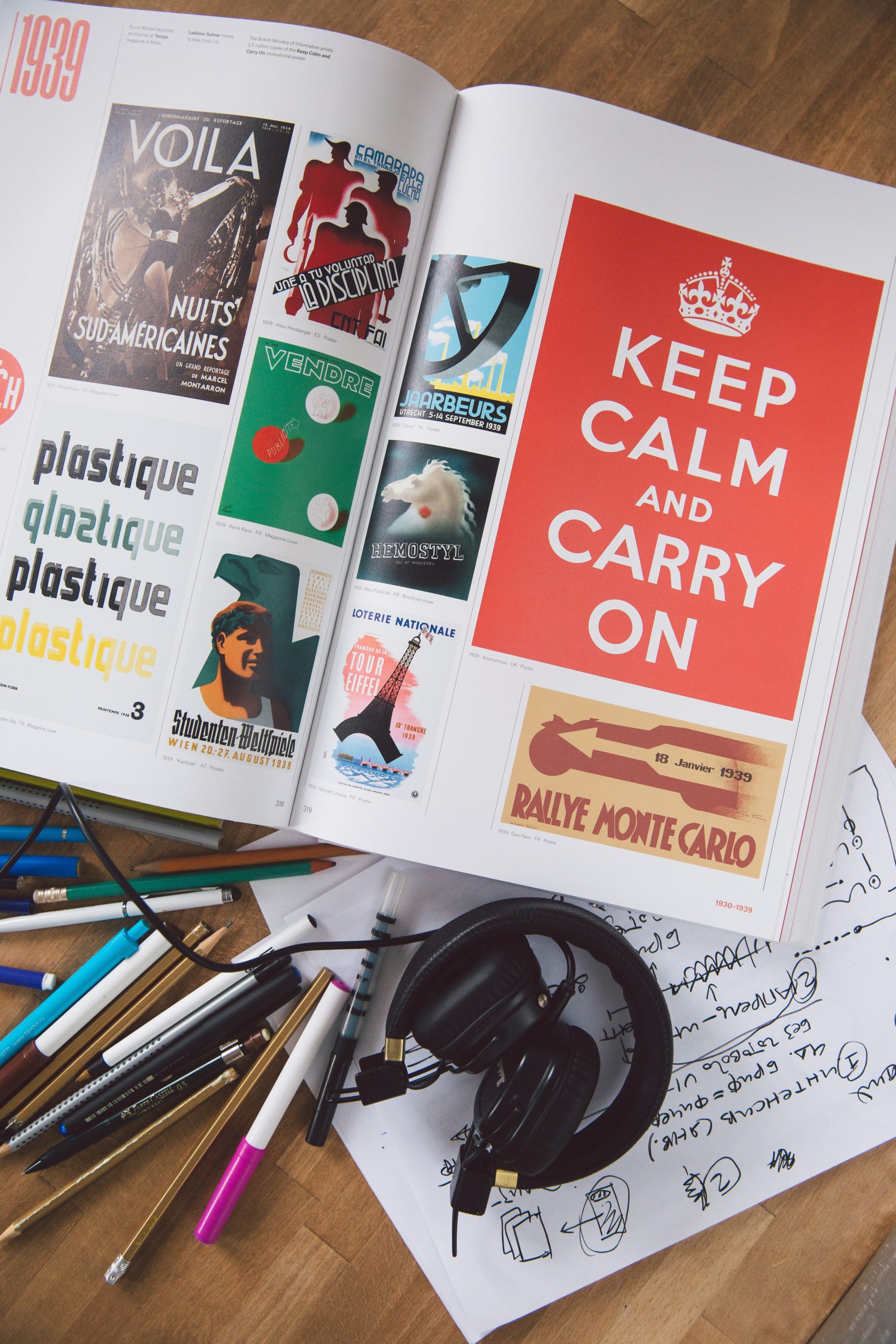
Form always follows function
What are you trying to say? What are you trying to do? What’s the purpose of your content? With an understanding of visual hierarchy and some visual hierarchy examples in your pocket, you’ll be on your way to achieving your communication goals. Read on…
Purpose of visual hierarchy
Visual hierarchy, at the most basic level, guides a person through the content presented. It signals to them which content is the most important, how that content is organized into related sections or categories, and which content they should focus on first. This is true whether the content is text, images, video, or something else.
How do you show hierarchy?
While knowing the concepts that create information and visual hierarchy is the first step, combining them is what really makes your content sing in-tune. When you show visual hierarchy through design, the path your reader or user takes through the experience is smooth and pleasant. When that happens, your content has done its job!
Throughout this article, I’ll show examples of visual hierarchy in action so you can incorporate it more easily as you design all kinds of content. I’m also including an overview infographic at the end of this article which demonstrates how each element of design works individually when creating content design hierarchy. We’ll begin by focusing on some key areas of visual hierarchy. Let’s get into it…
Elements of design – the highlights
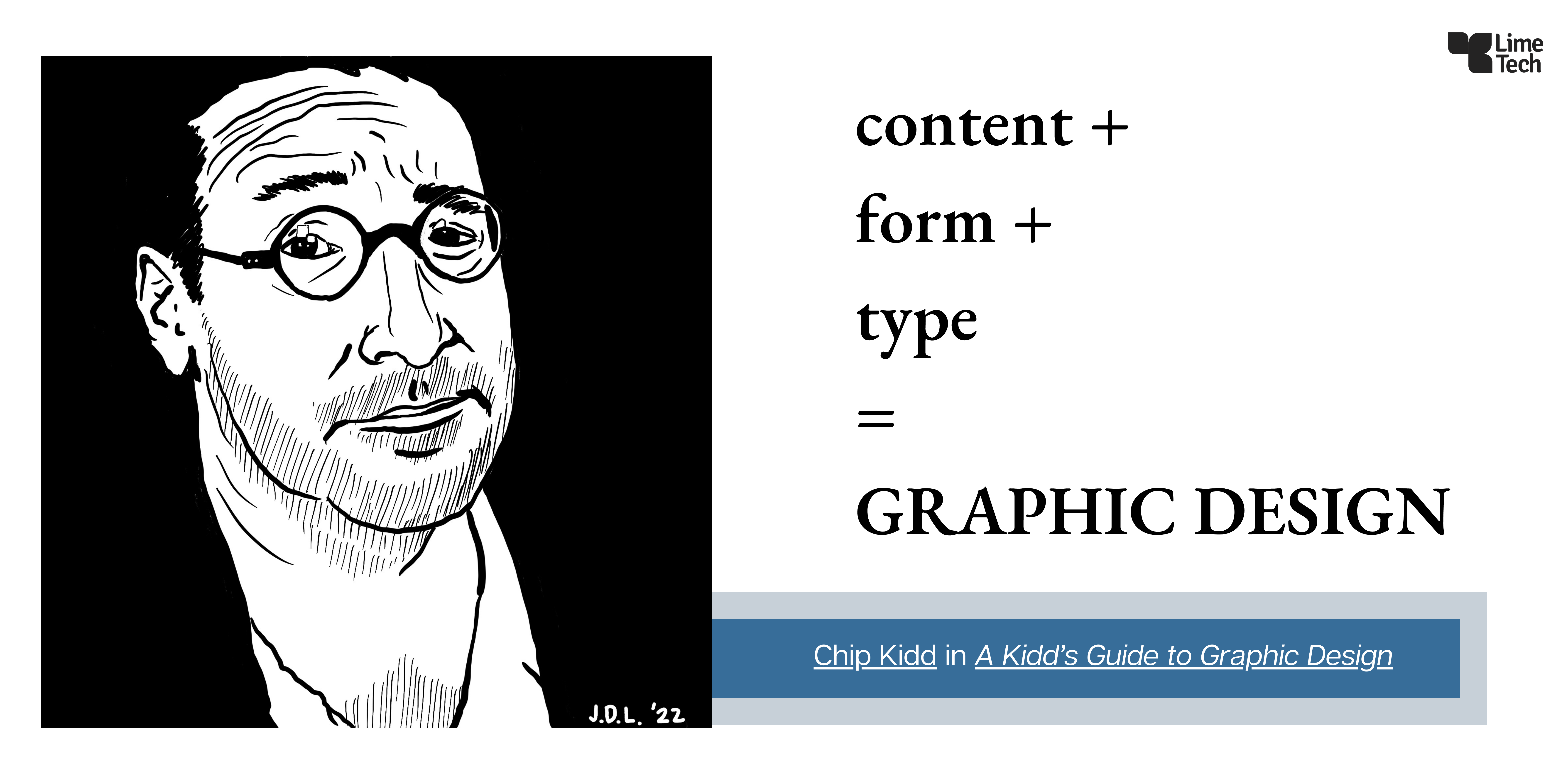
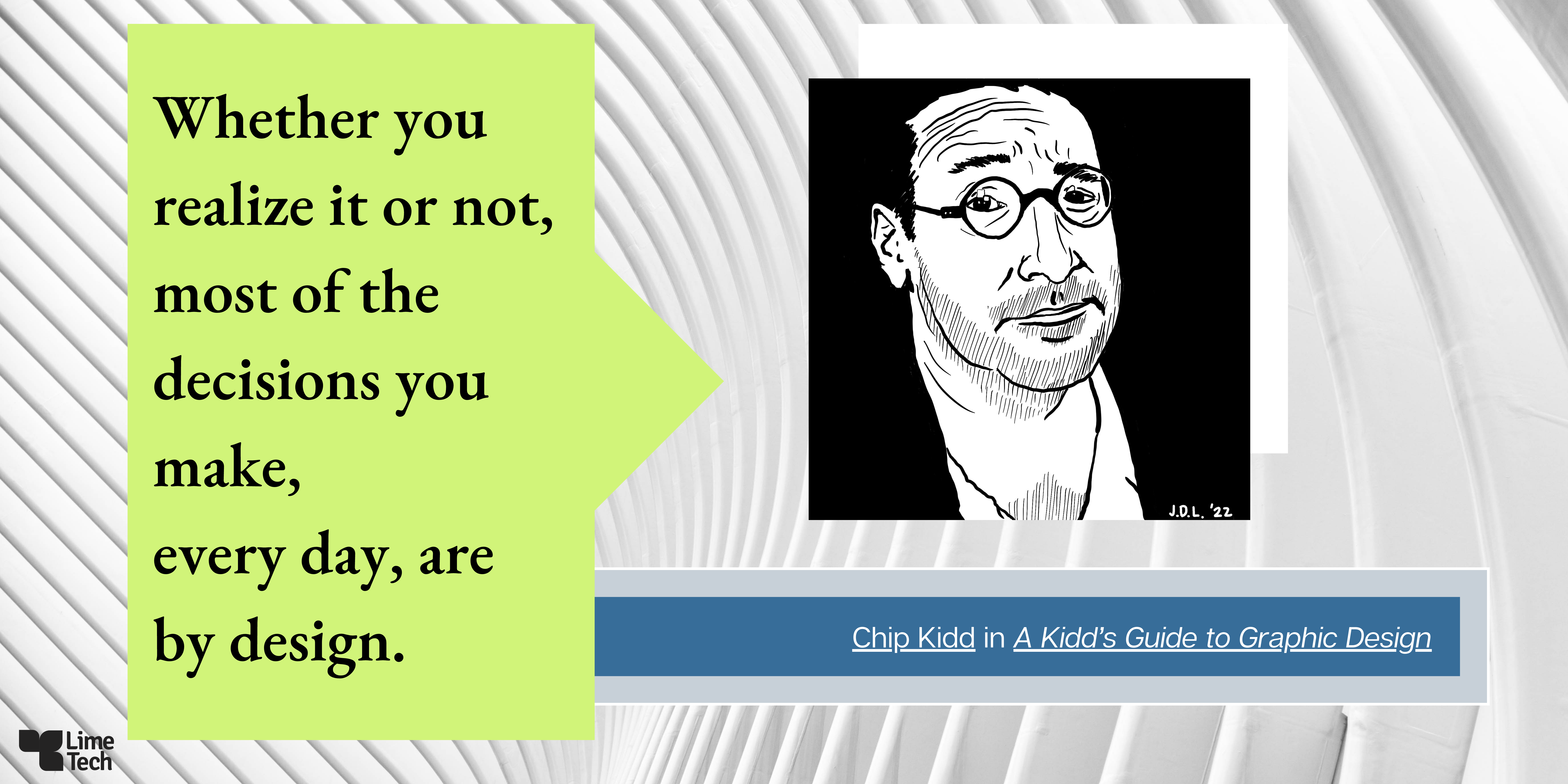
As seen above, I reference Chip Kidd a few times in this article because he’s one of the foremost graphic designers of our time. He designed the book cover for Jurassic Park, among over 1,000 other iconic book cover designs. Kidd is also the author of several books and comics, including a guide to graphic design, accessible for children and adults alike, titled, A Kidd’s Guide to Graphic Design.
Visual hierarchy in typography
Start with these key components when creating content and you’ll be on your way to clearly communicating your message.
For example, using two different complimentary fonts/typefaces creates a visual dynamic and helps guide the hierarchy of your readers from headers to supporting copy.
It’s common to use a mixture of font styles such as a serif with a sans serif, or a slab serif with a sans serif, or two similar sans serifs in ultra-bold and regular styles. This article by Moeller Printing gives brief definitions of the five main font types and when to use them. Typeface choices reinforce the way the eye travels across the page or screen. There’s more about eye-tracking later in this article.
Another example of visual hierarchy in typography has to do with directing focus: if you have two words next to each other in the same font but different colors, it’s impossible for the reader to know which one is more important. But if you change one of them so it’s displayed in bold, it becomes obvious which is the more important word – that’s hierarchy!
And in case you mistakenly had the notion that typefaces and font styles are only a matter of passing trends – Claude Garamond opened the first type foundry, a workshop devoted to developing and selling fonts to printers, in 1530. Garamond is still one of the most popular fonts used today. I used a form of Garamond for the type in the infographics, illustrating the Chip Kidd quotes, for this article.
It goes to show that when something becomes a classic it endures far longer than changes in seasonal trends. Can you imagine creating something today that will last for the next 500 years?
Using size and scale
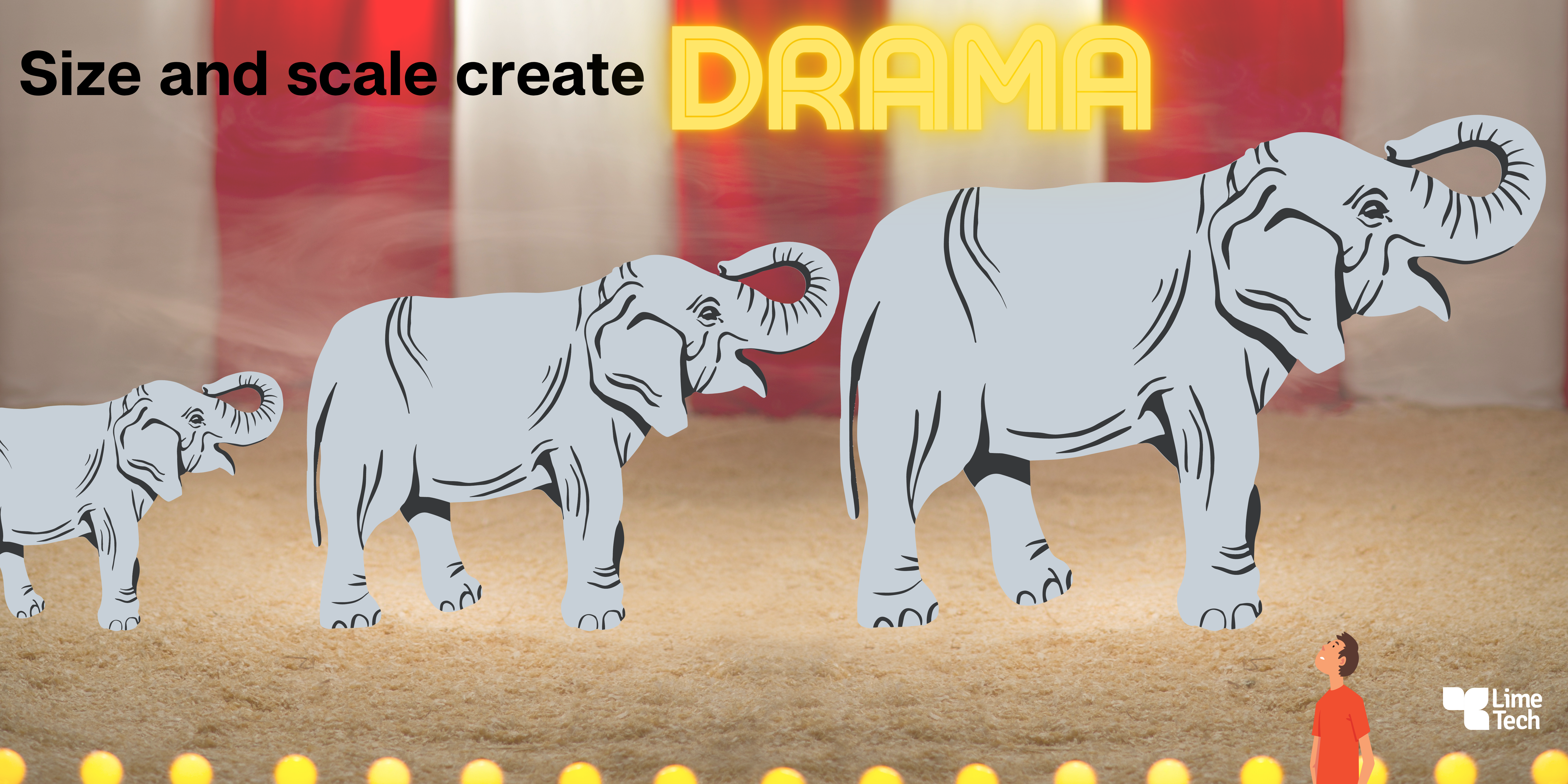
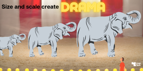
What’s true at the circus is also true in design: A dozen clowns strolling out of a school bus isn’t nearly as impressive as them popping out of a two-door mini, right?
Why does a long line of elephants impress us?
Because they are giant creatures who walk so lightly and quietly for their size. We look up at them and feel small: this uncommon change in perspective creates a dramatic effect.
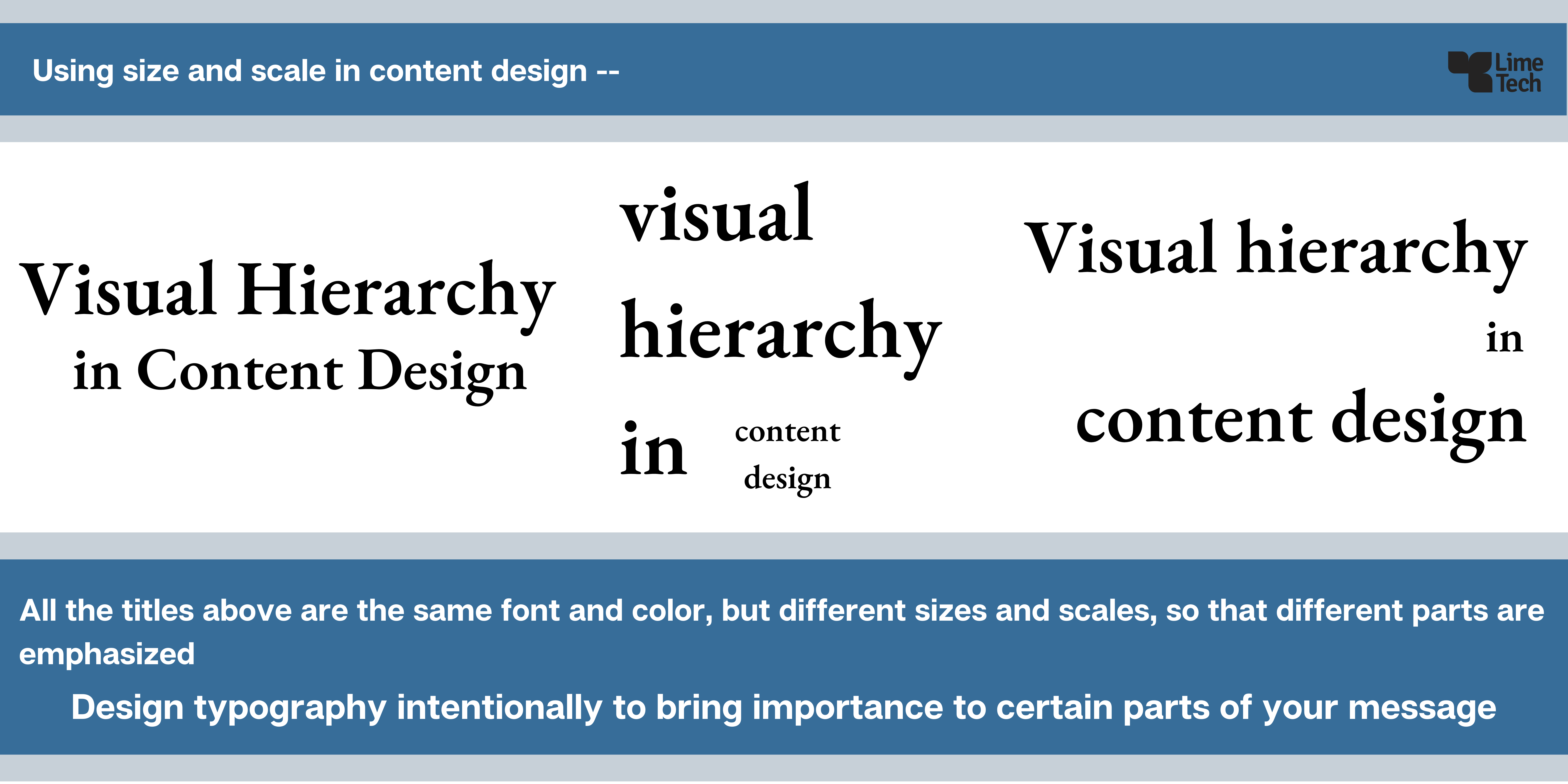
Use intentional pairings of extra large with much smaller sizes of type – and graphics – to create dynamics and denote visual hierarchy in your content design. Using the title of this article as an example in the infographic below, I show how pairing different sizes and scales of typography together create different effects.
Color’s role in hierarchy
Color choices are a key component of UI design as they influence the way your content is perceived on an unconscious level. The way users react to your content are highly influenced by not only the colors themselves, but by how you use them.
This article on Dribble’s blog goes into detail on choosing appropriate ratios for your main, secondary, and accent colors, palette application, and more.
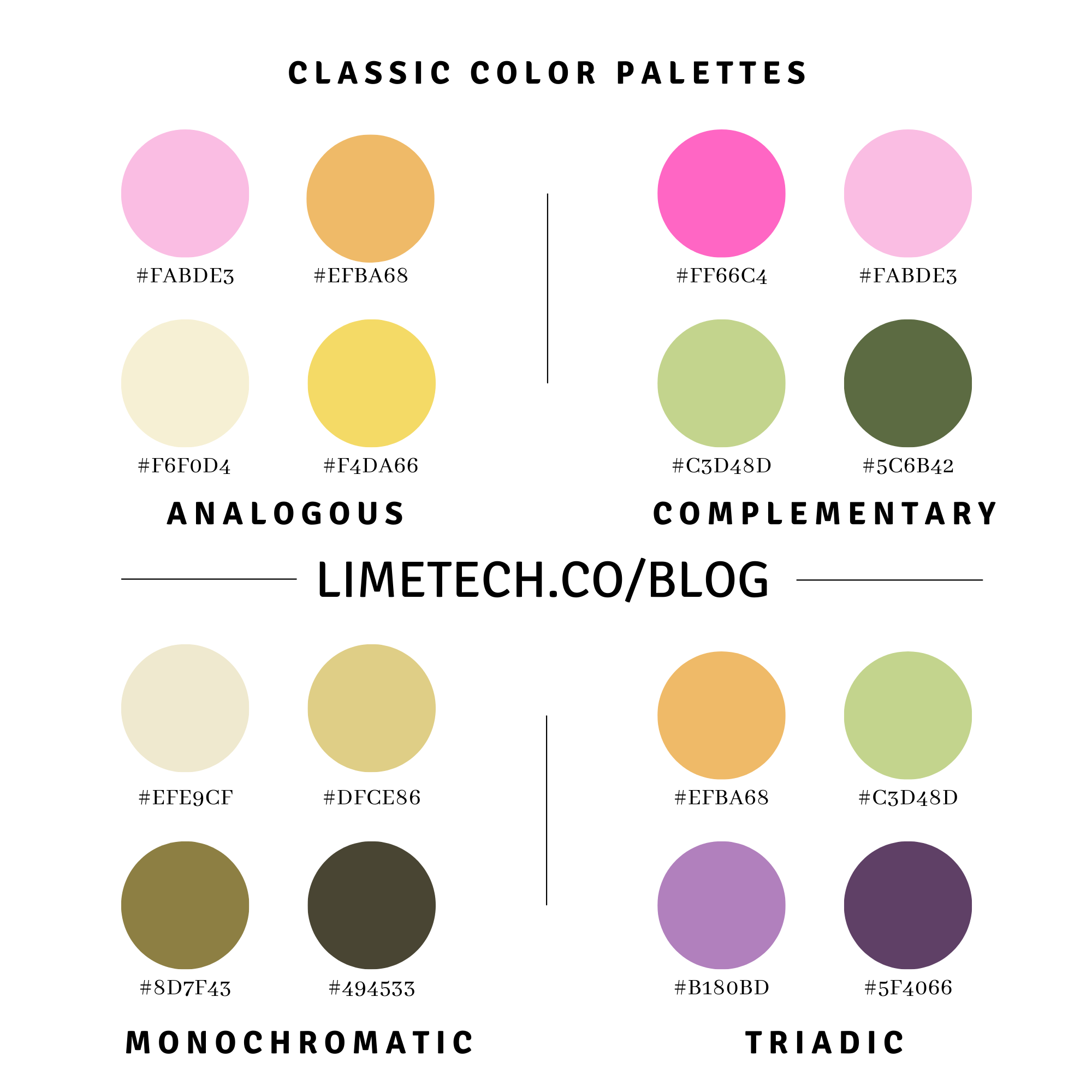
If you want to brush up on the basics of color, or learn about color pairings, bookmark the pair of articles I wrote last year on color terms and on how to choose a color palette for your app.
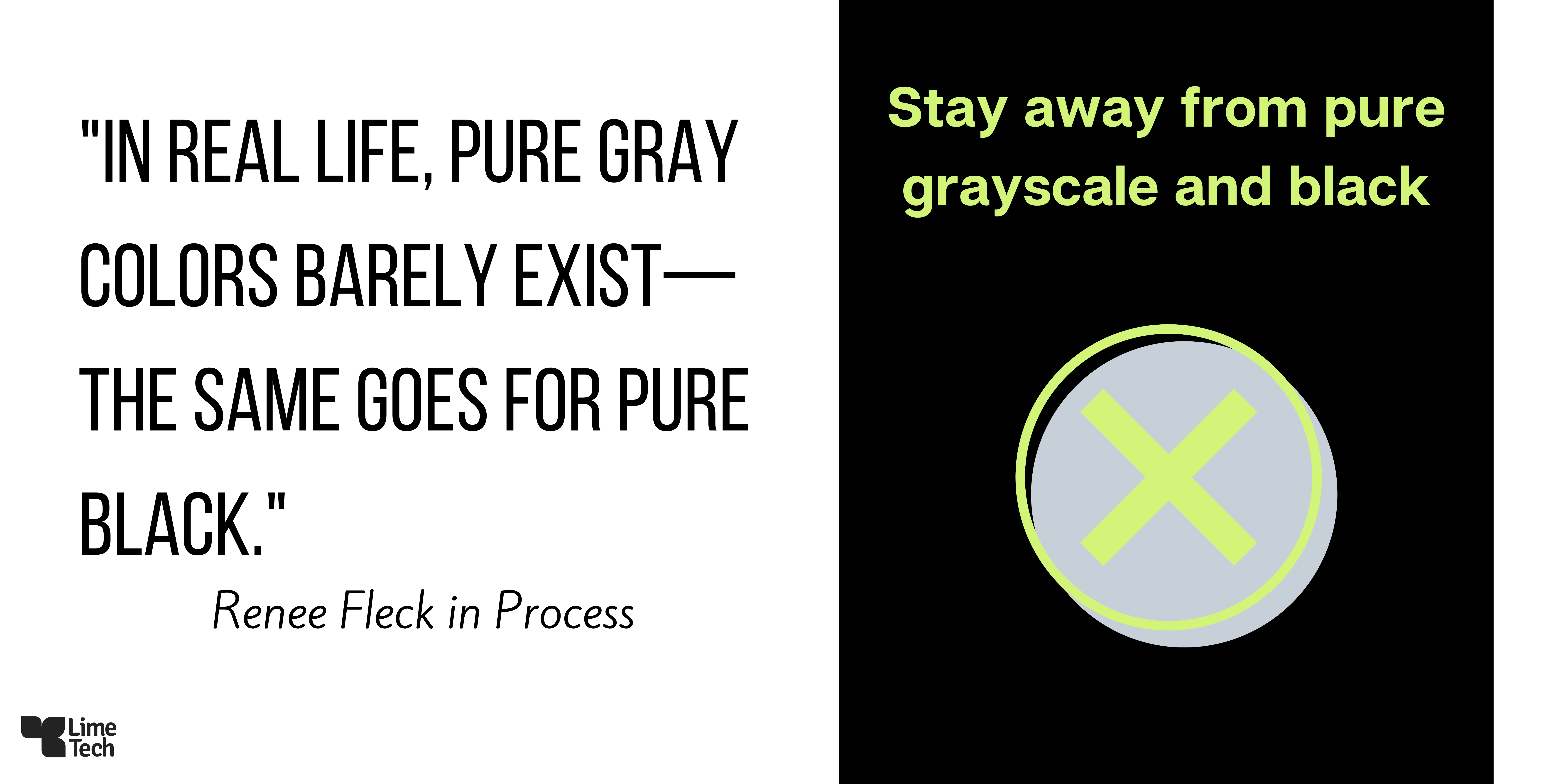
Let’s not forget about the role of the pure neutrals black and white — and their combination, gray. Neutrals provide breathing room, clarity in text, and balance out a colorful page. Also, as shown in the infographic below, adding a hint of a hue to pure neutrals will make them appear friendlier — as well as tie together your overall palette.
Accessibility and contrast
Before we leave this topic, let’s also touch on the importance of designing with inclusivity and accessibility in mind. As explained by WebAIM.org, contrast for reading on the web is of critical importance. A good place to start is with contrast ratios: “a measure of the difference in perceived “luminance” or brightness between two colors.” There are many tools for checking contrast ratios. Luckily for us, the clever people at Dribble share five useful and easy tools to check your content for visual contrast and accessible viewing. Employ these tools so your message can reach the largest audience possible.
Page tracking and eye movement
Eye tracking is another key concept in creating visual hierarchy. To engage your user as they scan a page, use “Z” and/or “F” patterns to orient the text and graphics in a pleasing way.
Wordstream’s blog talks about the importance of visual hierarchy as it relates to natural eye tracking.
The key thing to remember here is that the user’s eye movement starts in the top left and moves across the page before scanning down the page to search for an element they find engaging. For elements you want visitors to notice on a text-heavy page (like an image), placing them in the F pattern ensures the elements are seen.” Z “The Z-pattern layout is typically used on pages that are not content heavy. Its design mimics the route the human eye travels when it reads — left to right, zigzagging top to bottom.
Spacing
Negative space plays a critical role in influencing eye movement – it literally creates resting moments, experienced as space, as your eyes scan the page. Negative, or blank, space allows the viewer time to process the information you’re presenting. For example, too little negative space interferes with the needed processing time and promotes anxiety and confusion. While too much negative space can cause your user to lose interest and leave entirely, yikes!
Spacing is one of the basic elements of design: many different examples of how to use spacing are shown in the blue infographic at the end of this article. Use of spacing applies to every single section of text to images to design elements, etc., as well as the whole page or screen.
Overview of visual hierarchy
The infographic below shows how each element of hierarchy plays a role in content design. While you can’t possibly use every design concept in EVERY design you create, using design strategically and intentionally will ensure you deliver the message you intend, with impact.
 Infographic by Toptal
In conclusion, the concepts demonstrated in this article along with the visual hierarchy examples given, will guide you on your journey of content creation. The more you put these guidelines into practice, the stronger your content will grow. If you found this article helpful or have any questions that could prompt a future article around content creation and design, please contact us with your comments or suggestions.
LimeTech is a creative tech company with a focus on app development. We help brands grow their impact by building digital products that please customers and solve business challenges. Our work includes strategy, design, content, and tech planning. Check out our portfolio or reach out to start a conversation about your project.
![Nice to meet you, color! Color terminology explained. [updated]](https://limetech.co/storage/2021/09/reuben-4CCJ-NOUkB0-unsplash-1-496x330.jpg)
![Hello, color! How to choose colors for your app. [updated]](https://limetech.co/storage/2021/09/Classic-Color-Palettes-by-LT-1-e1632426574132-1-e1654885904844-550x248.png)
