How to make a mobile app that stands out from the crowd

The mobile app landscape is crowded. You know this. You may even know that a thousand apps are launched each day in Apple’s app store alone, and considerably more in the Google Play store. But you’ve got a great idea and you’re determined to push forward. That’s great! You’ll have to work strategically to stand out.
Here’s how to make a mobile app that stands out from the crowd:
#1. Know thy target user

The best mobile apps are built on a robust understanding of their target user(s). Know your user’s biggest challenges and greatest desires. When you delight them with a mobile app that feels like it was custom-made for their needs, they’ll become loyal followers.
Do competitive research to find out how your market competitors target their users, and conduct early user research to paint a complete picture of those you’re aiming to reach. Keep an open mind and ask open questions. This will help you uncover needs and desires you weren’t expecting. And document, document, document. You never know which piece of information will be important later.
All of the data you collect will help you identify and articulate your customer’s needs and your unique selling proposition. This work will inform your decisions at every stage.
#2. Be memorable with the right app name
Naming your app can feel a bit like naming a child. It can be one of the most challenging parts of the process of building and launching a new mobile app. You want your new app name to be unique, relevant, and memorable, and to convey the purpose of your app as much as possible.
As with any time you generate a new idea, you’ll likely start your app naming process with a brainstorm session. Keep all options on the table at the beginning, and unleash your creativity with blue sky thinking. If you run out of ideas, you can try using an app name generator like Panabee or Namelix.
Keep in mind that your app name should be short. It will need to comply with app store and home screen character limits.
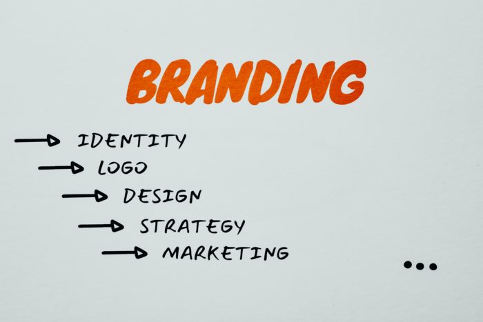
#3. Create an impression with professional branding
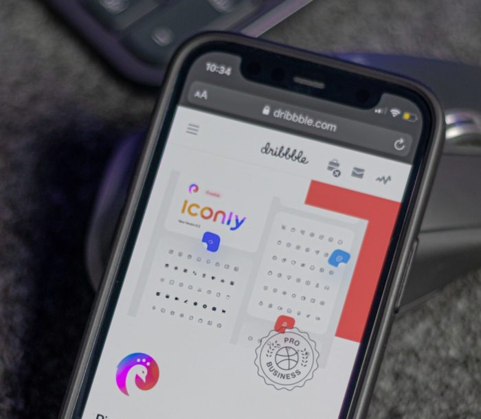
Your app branding may be one of the most important aspects of creating a mobile app that stands out from the crowd. First impressions count, and your logo and app icon will always reach customers before all other content.
After doing competitive research and establishing your customer needs and unique selling proposition, your fundamentals are in place. You’ll also need to consider industry regulations and the relevant design guidelines for Android and iOS.

Next, consider the emotional impact and messaging you want to convey with your logo and branding. Color plays a major role in this area, so you’ll want to take your time finding a color scheme to ensure visual harmony.
Above all, keep it simple. The best app logos and icons are clear, simple, and easily recognizable. The process of developing the perfect logo and branding is both challenging and rewarding.
#4. Connect with users with the right voice and tone

Connect with users and give your brand personality by applying voice and tone to your UX writing – the written content that appears on your app. Hitting the right voice and tone can really make an impact with users, as brands like MailChimp and Duolingo have learned. Check out our article where we cover real-world examples of voice and tone in action.
Be clear, concise, and human, and have fun with the process, as this is a great place to apply your creativity. Just be sure to avoid terms that could be considered offensive or exclusionary.
To keep things on-point, try reading your content out loud to measure the effect. And put your best work forward by testing it and rewriting as many times as needed. Tone can be a tricky area, and brands spend many iterations finding the perfect turn of phrase.
#5. Make navigation easy with intuitive user flows

Plan how your user will enter and navigate their way through your app by creating intuitive user flows. A user flow is a kind of flowchart that maps how the user will engage with app features and travel from screen to screen. Your user flows are built on a clear understanding of your user journey, as well as the successful outcomes you’d like to achieve.
Your user flows, created by your user experience (UX) designer, will inform the development of your user interface (UI) designs, so you’ll want to get this right.
#6. Please them with clean, clear UI design

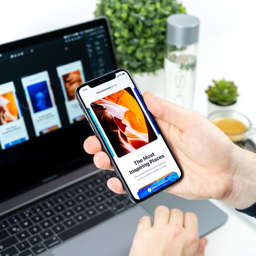
Your app’s UI design is another important area where your app can really stand out from the crowd. Your mobile UI is your graphical interface – the screens and visual components that your user will interact with. A clean, clear mobile interface will often make the difference between an app that sinks or swims.
Take a minimalist approach to your UI design to please the most users. Your layouts should be simple and uncluttered, to prevent confusion and allow for easy navigation. Focus on harmony and consistency to provide the most pleasant and impactful experience for your users. And remember your app needs to comply with very specific requirements from Apple and Google, so apply responsive design that’s appropriate to the platform.
#7. Be found with app store optimization (ASO)
Did you know that one in four users discovers an app by searching in the app store? App store optimization is the process of optimizing your app store listing so it can be discovered more easily. Just like search engine optimization (SEO), ASO leverages keywords to improve the chances of app discovery.
ASO can be applied to several key areas of your app store content, including app name and title, keywords, app description, and subtitle. Several of these areas have character restrictions, so be purposeful and concise when applying your keyword strategy.
#8. Keep them happy with frequent updates

You’re heard of “Always be closing” – that famous line from the play “Glengarry Glen Ross?” Well, “always be updating” is good guidance for your app.
Frequent updates to fix bugs, add features, improve the app, and protect your users from security threats are the norm. You’ll document all your updates in the What’s New section of your app store listing, and as mentioned above, you can keep your users informed with push notifications.
#9. Stay on the radar with push notifications
Get your users to enable push notifications and you have a way to reach them anytime, anywhere. Notifications are a great way to announce new features, updates, and product promotions. The key is to focus on providing value to your users each time.
Push notifications are one of the most proven ways to stimulate user engagement. Use notifications sparingly, though, as too many notifications can be a big turnoff, resulting in uninstalls and push disablement.
#10. Conduct user testing to give them what they want

The best app developers want to know what challenges their users are facing and what outcomes they’re looking for. You can find this information in a variety of ways. Recruit prospects from your target demographic and conduct user testing in person, or do it online through a platform like usertesting.com.
Put your app in their hands, even if it’s just a rough beta version. Assign them tasks and ask them to talk through the process of navigating your app. They’ll quickly identify blocks, points of tension, and areas of confusion.
Test a large sample size to get an accurate understanding of the global issues, and document your data in a spreadsheet or collaborative software like dovetail or notion. This information is gold, and will help you prioritize the most pressing issues with your brand new app.
Wrap-up: How to make a mobile app that stands out from the crowd?

We’ve covered a lot of territory in this article, and we could have written even more. However, we’ve covered the main ways you can make your mobile app unique. Now that you’ve got some ideas, you should be well equipped to get your project underway.
Good luck to you on your project, and if you ever need help, we’re there for you. Get in touch and we’ll schedule a complimentary consultation to discuss your project.
LimeTech is a creative tech company with a focus on app development. We help brands grow their impact by building digital products that please customers and solve business challenges. Our work includes strategy, design, content, and tech planning. Check out our portfolio or reach out to start a conversation about your project.

![Everything is agile [updated]](https://limetech.co/storage/2021/11/yogendra-singh-0WYnzbYIRK0-unsplash-550x309.jpg)
![Nice to meet you, color! Color terminology explained. [updated]](https://limetech.co/storage/2021/09/reuben-4CCJ-NOUkB0-unsplash-1-496x330.jpg)